"Dusty Ventures" (dustyventures)
10/21/2016 at 13:38 • Filed to: None
 0
0
 18
18|
"Dusty Ventures" (dustyventures)
10/21/2016 at 13:38 • Filed to: None | 0
| 18 |
Howdy, folks! I’ve got an issue, and I could use some assistance.
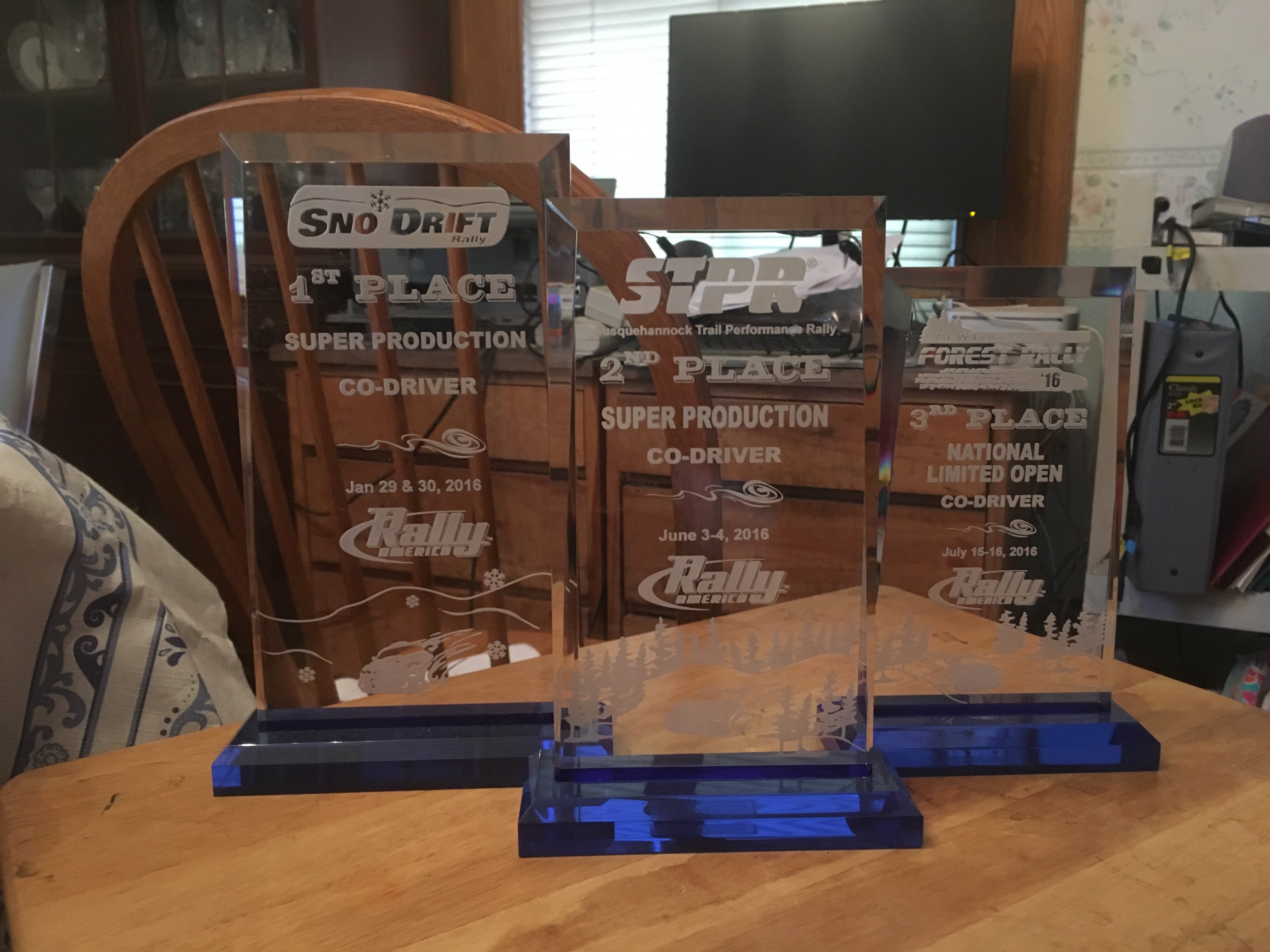
I’ve got six of these trophies from the 2016 rally season. I’m fairly fond of them. The problem is, being clear and all, they’re hard to read under the best of circumstances, and virtually impossible when backed by the !!!error: Indecipherable SUB-paragraph formatting!!!
I’ve given some thought to what I’d like to do. Obviously the simple solution is to pick a color to back it with, but that’s no fun. So what I want to do is give each a backing design, something stylish in it’s own right, but at the same time making it easier to view the designs and writings on the trophy itself. Unfortunately I suck at art.
Fortunately a lot of you don’t suck at art, so I’m requesting your assistance. I’m looking for six unique designs for my six trophies. Each design will be printed on clear vinyl and put on the back. You’re encouraged to go with anything you think will look good, but some ideas I’ve had so far are 1) using color-flattened or stylized images of the cars from the races, 2) using the color palette from the cars (difficult since the car from 100 Acre was plain white), 3) a design that draws from/compliments either !!!error: Indecipherable SUB-paragraph formatting!!! above the trophy shelf or the season championship trophy (below).
I can provide photos of each trophy to anyone interested (on grid paper if it helps for sizing/placement), along with photos from the events. I’m willing to provide compensation for each of the six selected designs in the form of either two Oppo stickers or $12.
 CB
> Dusty Ventures
CB
> Dusty Ventures
10/21/2016 at 13:41 |
|
Not artistic here, but I suggest all designs incorporate the rally duck.
 Urambo Tauro
> Dusty Ventures
Urambo Tauro
> Dusty Ventures
10/21/2016 at 13:44 |
|
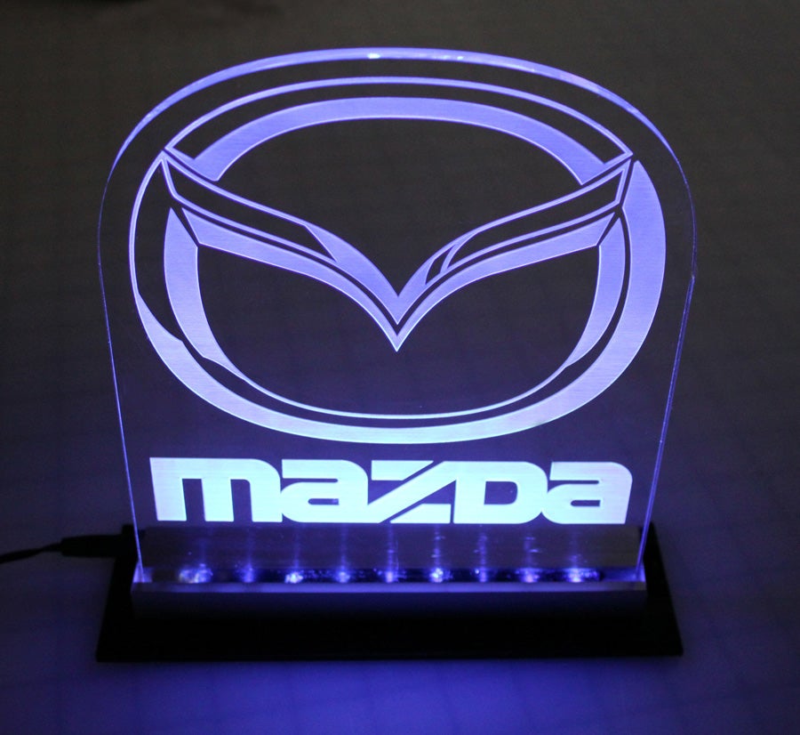
Does that base interfere with simply lighting from underneath, like this?
 TheHondaBro
> Dusty Ventures
TheHondaBro
> Dusty Ventures
10/21/2016 at 13:45 |
|
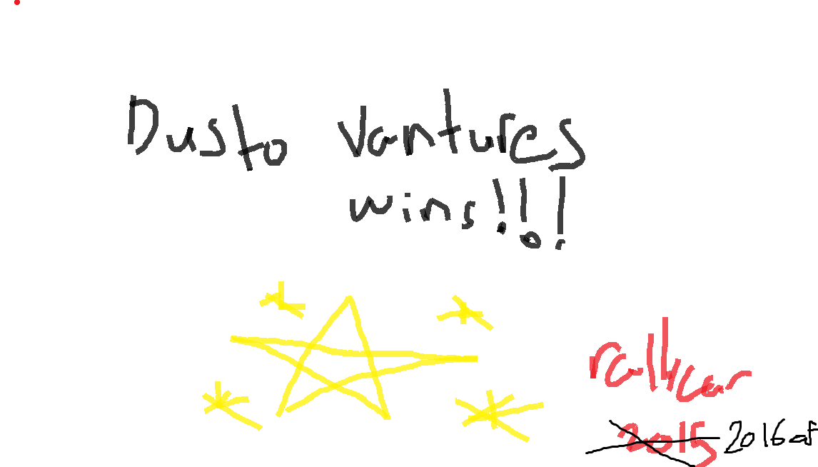
I just did this one. I’m really proud of it.
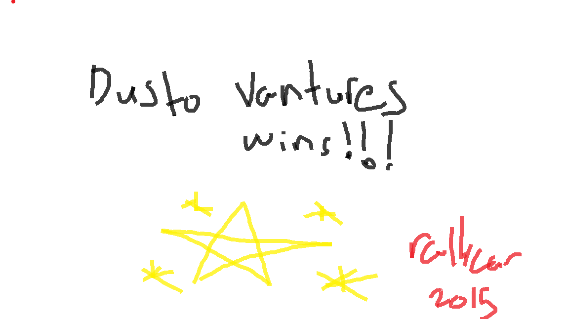
I’ll take a couple of Ken Bone Oppo stickers.
 MonkeePuzzle
> CB
MonkeePuzzle
> CB
10/21/2016 at 13:46 |
|
chicken?
|
TheHondaBro
> MonkeePuzzle
10/21/2016 at 13:47 |
|
!!! UNKNOWN CONTENT TYPE !!!
 TheTurbochargedSquirrel
> Urambo Tauro
TheTurbochargedSquirrel
> Urambo Tauro
10/21/2016 at 13:48 |
|
I like this idea. Shouldn’t be too hard to do either. Though it will only work if the text is etched into the glass. The light wouldn’t be defused if it is painted on.
|
CB
> TheHondaBro
10/21/2016 at 13:48 |
|
“DUCK SEASON”
“CHICKEN SEASON”
|
Dusty Ventures
> TheHondaBro
10/21/2016 at 14:02 |
|
I love it, but you got the year wrong
|
TheHondaBro
> Dusty Ventures
10/21/2016 at 14:04 |
|
|
Dusty Ventures
> Urambo Tauro
10/21/2016 at 14:05 |
|
I have my doubts, the base is a separate block connected via double sided tape, but I’ll give it a go
 If only EssExTee could be so grossly incandescent
> Dusty Ventures
If only EssExTee could be so grossly incandescent
> Dusty Ventures
10/21/2016 at 14:28 |
|
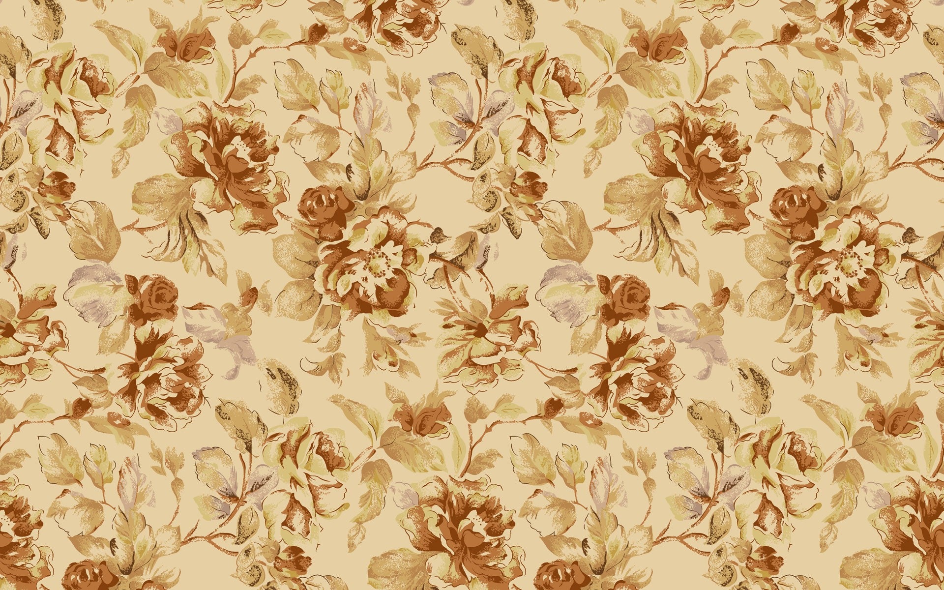
Vintage wallpaper patterns.
|
Dusty Ventures
> If only EssExTee could be so grossly incandescent
10/21/2016 at 14:44 |
|
No stickers for you
 OPPOsaurus WRX
> Dusty Ventures
OPPOsaurus WRX
> Dusty Ventures
10/21/2016 at 14:46 |
|
underlighting was my initial thought as well
|
OPPOsaurus WRX
> Dusty Ventures
10/21/2016 at 14:56 |
|
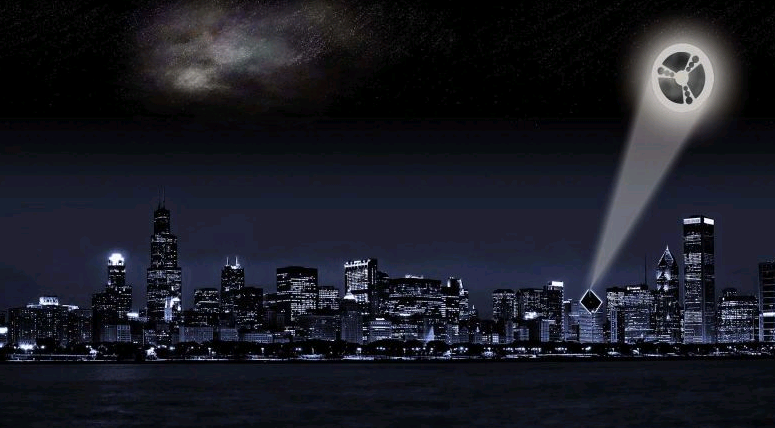
this should be the official OPPOsignal
|
If only EssExTee could be so grossly incandescent
> Dusty Ventures
10/21/2016 at 15:27 |
|
I already have one anyways neener neener
|
Dusty Ventures
> TheHondaBro
10/21/2016 at 16:09 |
|
|
Dusty Ventures
> CB
10/21/2016 at 16:11 |
|
I approve of this
 Agrajag
> Dusty Ventures
Agrajag
> Dusty Ventures
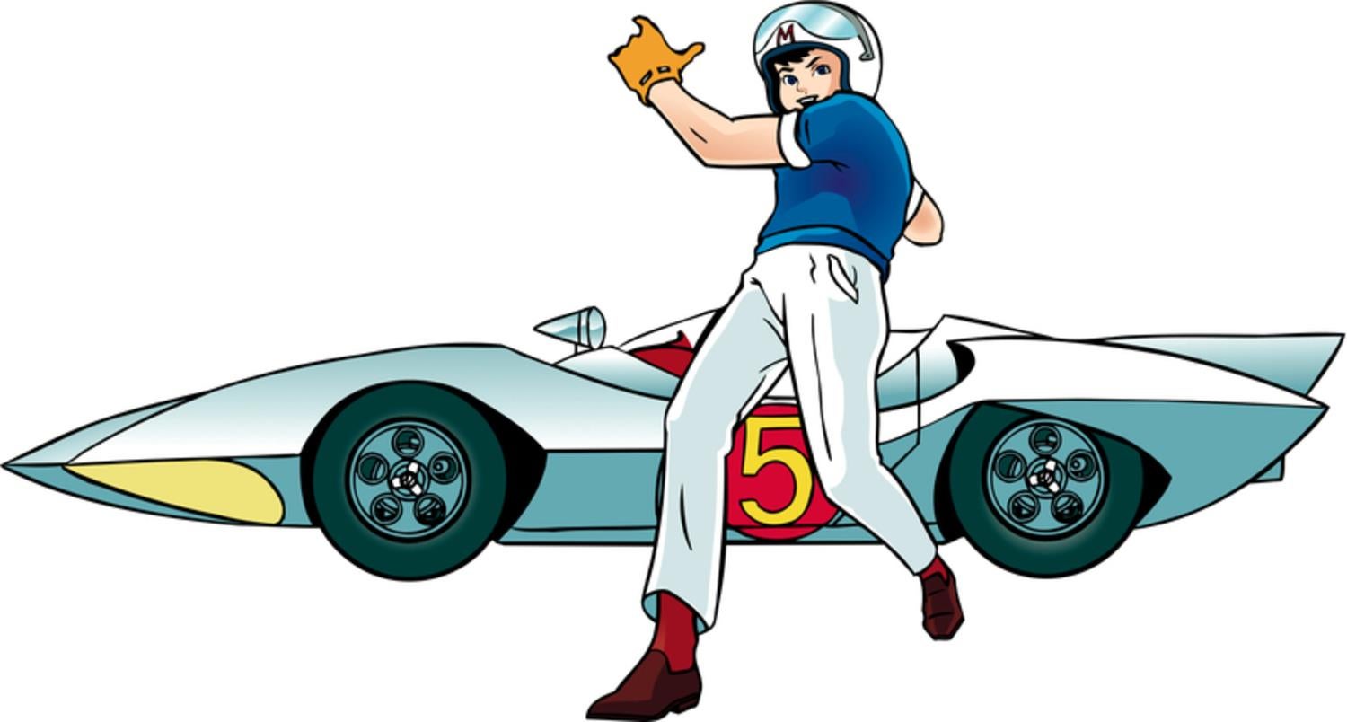
10/23/2016 at 21:11 |
|
How about a rendition of Dusty in this Speed Racer pose?